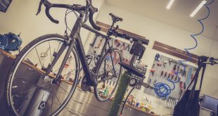
There’s a buzz in the air at the Triumph Road HQ of Raleigh UK, a tangible sense that a corner has been turned.
"We’re now a lot lighter on our toes," said Steve Davey, Raleigh’s sales and marketing director.
"The decision-making chain is a lot shorter. People are now a lot more empowered."
Raleigh’s new look is being supported by lots of new PoS materials, all available from today.
This is the first time in four years that Raleigh has had a full POS programme in support of a new range launch.
This is also the first time in some years that Raleigh has built up stock before showing off the ‘samples’.
"Having stock available of the new range will help build back credibility with our customers over the coming months and great emphasis is being placed on getting the mix of product together with forecasting demand correctly," said Davey.
The rebranding and bike launch has gone well so far.
"Reaction to the re-positioning of the Raleigh brand has been extremely positive. We have been successful in satisfying the whole spectrum of our customer base by offering a very commercial range where great emphasis has been placed on colour, graphics and visual value for money rather than detailed, technical overspecification," said Davey.
The new MTBs start at £119 and top-out at £279. A new sub-brand – Virus – is what Davey calls a "tactical" brand and features bikes at pricepoints that the Raleigh brand "would not wish to directly compete at."
"Virus models such as the £139, well-equipped, full-suspension Cyanide will provide our customers with a complementary range to Raleigh and ensure that Raleigh stockists remain very competative whilst retaining products built around the strength of a brand
and not just price," said Davey.
All the new Raleigh bikes (there’s a new road range too) come fitted with the new Raleigh head-badge.
The heron stays but it’s no longer surrounded by heraldic scroll-work. The red and the gold stay but have been made deeper and more vibrant.
There’s no longer a reference to Nottingham.
"There’s no underhand reason for this. We want to get consistency back. This logo will eventually be adopted throughout the USA and beyond therefore one recognised logo relevant to all markets was required," said Davey.
Whilst Nottingham may have been dropped, the company makeover majors on Raleigh’s Britishness. A stylised RAF roundel features as part of the graphic design on many of the new bikes and is used on PoS materials too, including floor stickers and wall hangers.
The Raleigh lettering reverts to a chunky, slightly-italicised full-colour affair which has more in common with the lettering of the 1970s onwards rather than the skinny, blue typeface used for the past three years and which never translated well to downtubes.
The new Raleigh lettering is also joined by a small Union flag.
"This isn’t just an exercise in Cool Britannia, we wanted emphasis on the fact that Raleigh is a truly British brand and proud of it,"said Davey.
Not quite so subtle is the ‘Best of Britain’ taglines in the A4 catalogue and on the PoS materials. City bikes are being promoted as stylish, comfortable and "ready to wear" with the imagery of Saville Row and a tag line of "style never goes out of fashion."
Junior bikes (now called Jnr bikes) are promoted with a cool, black kid on an inner city estate, carrying a basketball and wearing a long-sleeved t-shirt with a monotone Union Jack on the front.
"There’s a lot of fun you can have visually without having to feature a bicycle all the time to get your message across," said Davey.
The corporate makeover, bike graphic restyling and PoS design is the result of in-house and outside agency involvement. BLD of Belguim and LLE/H of London were enlisted to help create the launch programme. LLE/H also helped to spec the paints used on the new bikes, many of which utilise prism effects to stand out from the crowd.
And also standing out from the crowd will be the Raleigh HGV fleet. The company’s 16 tractor units and 32 trailers will be rebranded over the coming months.
The redesign is aiming to add value to the Raleigh brand proposition, giving people a story, a brand position, rather than just a no-name bicycle.
Later in the year the redesign will be backed by a print media ad campaign.
Jnr bikes – due for launch at the International Cycle Convention in Harrogate, 26-28 May – will for example be promoted in youth titles such as ‘Shoot’.
How much did Raleigh spend on the makeover?
"The total cost of all the creative work cost less than £10 000," said Davey
"This is only the beginning. Much more will be put behind the new Raleigh branding over the coming 18 months."